Moët & Chandon
Concept | Design | Branding | Typography | UX/UI | HTML | CSS | ActionScript
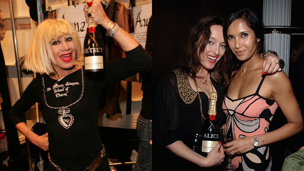
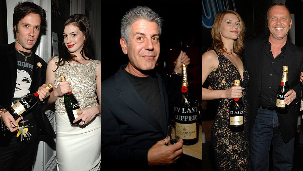
Interactive application placing Swarovski™ elements on bottles of Moët & Chandon. One click purchase option to deliver personalized bottles to your door.
À Votre Santé
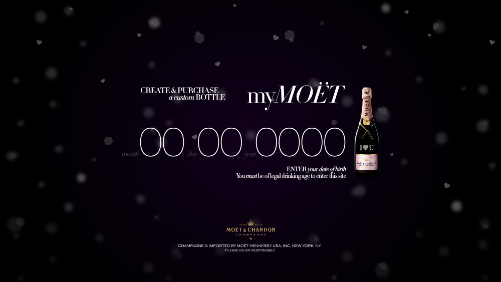
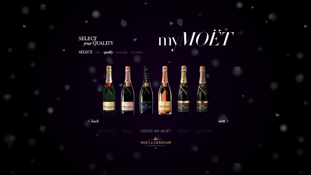
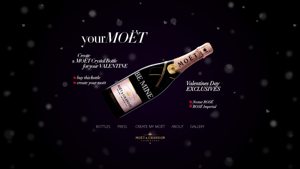
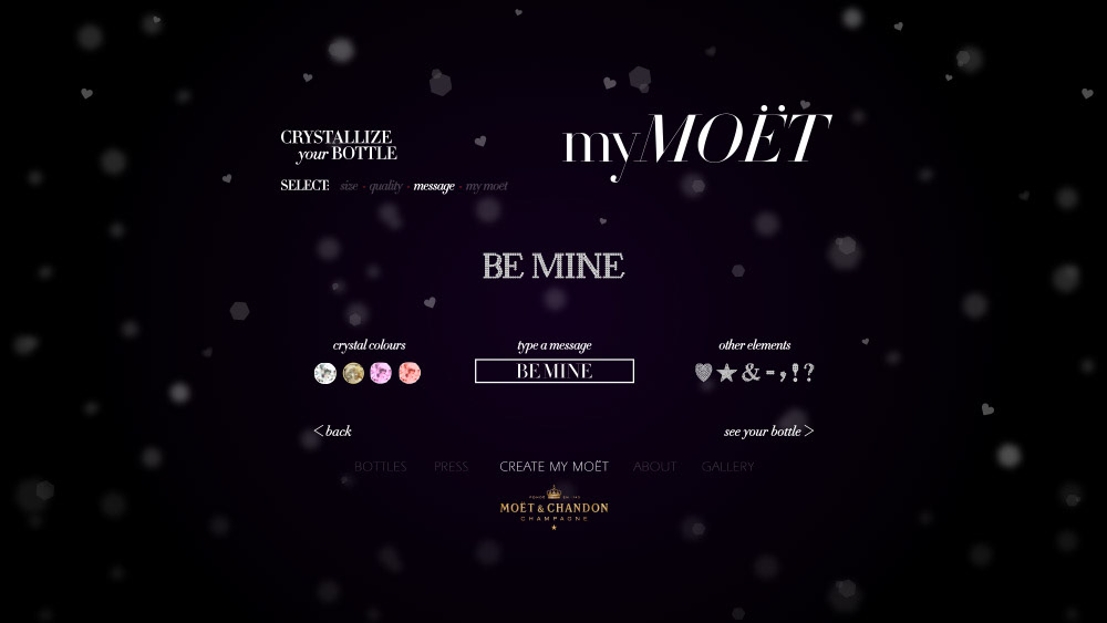
MyMoët was a simple step by step interactive microsite designed in Photoshop and developed in Flash. Upon arrival, the user was treated to a bubbly interface of light and shadow. The first step in creating a custom bottle was to select your bottle size. Next, users could select between a number of qualities followed by a robust messaging interface designed using a combination of vector art and photography. The final step was a realistic (code heavy) 3D rendering of yourMoët with link to purchase.
A Toast
When the corks are popping and friends are high with delight. When the room is as full as the moon, and your glass as the night. Have another sip my love. Everyone, bottoms up! “Too much of anything is bad, but too much champagne is just right.” –F. Scott Fitzgerald